
Review: 3 Dimensional Contrast: Principles of Lighting for the Digital Age
To many of us, “contrast” is an afterthought — a slider in Photoshop or a setting in our cameras that has something to do with the relationship between the dark and light areas in our images. We use the slider without vision or purpose.
To Dean Collins, controlling and manipulating contrast was the heart and soul of what we, as photographers, do. Contrast is the tool we use to transform a two dimensional image (height and width) into one that has a third dimension — one that manifests depth, shape and texture.
The magic wand that takes us to this new dimension? Our lighting. Carefully placed and controlled with a strategic plan and an artistic eye, our lights can transform a flat, two-dimensional image into one that jumps off the page.
No one knew this better than Dean. He dedicated a good part of his life to teaching photographers around the world the simple truths about contrast. I’ve already dedicated a newsletter to Dean, mentioned how disappointed I am that I never got to know him, and made clear how profoundly influenced I have been by his teachings.
In this post, I am pleased to be able to share some of those teachings in a review of a new DVD, 3 Dimensional Contrast: Principles of Lighting for the Digital Age, put out by Dean’s legacy company, Software-Cinema. In the video, two of Dean’s best friends and past students, Tim Mantoani and Bill Holshevnikoff do a great job of presenting the concepts and demonstrating them in the studio.
Contrast 101: Part I — The Basics
(More to follow in future posts.)
Perhaps, the most important thing Dean did for us was to give us a vocabulary for use in discussing contrast. “Lighter” and “darker” really don’t cut it.
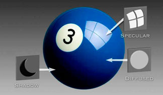
Dean came up with 3 terms to represent key concepts. They are what Dean would call different light “densities” and appear on the picture below:
To really get a handle on contrast and as a first step on the path of learning how to create and control it, let’s talk about what each concept means:
Diffused Value: The diffused value is measured at the place where the light is spread evenly over the subject. It is the area in which we see the true tone or color of the object. In this case, it is the blue color of the 3 Ball. Our task as photographers is to make sure that when we capture this image, the blue we capture is the true blue of the ball. Dean would tell us that the blue is “objective” meaning that there is a way to empirically measure it and replicate it. To properly capture this tone, we must light and meter correctly. If we do, our blue will equal the actual blue of the ball. If we don’t, it will be some other color.
If we use our lights and meter so that every part of the blue ball is be lit in a way that the color is “objective” or consistent throughout the image — the ball will look absolutely flat; it will have no shape, depth or texture; it will look like a dot, not a ball. We will have a “proper” exposure and a boring image — like my dot, below.
Compare my “dot” to Dean’s 3 Ball. It is the shadow and highlight that make Dean’s ball appear to be round and the texture shiny. But, truth be told, they are both truly 2 dimensional — they have height and width — but no depth.
And, therein lies the creative power of contrast: it gives depth and dimension to the image. An all blue dot has no contrast. It is an even, diffused color in all places. So, to give it shape, we must create contrast between the shadows and the blue and the highlights and the blue.
(Want to prove this to yourself? Take the dot into Photoshop or your post production software. Put a shadow on the left side and a highlight on the upper right. The dot will turn round and become a ball.)
Do we want to use our lights to create contrast in all of our images? Is there a place for “flat lighting” — lighting that captures all of the tones in an objective manner, lighting that does not create depth, dimension or texture by way of manufacturing shadows or specular highlights? Is there a time when we want to create “dots” — images that reflect the exact tones of our subject?
Sure. When the depth and texture are coming from somewhere else, we often use flat lighting as a way to best capture it. For example, if we have a model upon whom a make up artist has spent a great bit of time adding shadows and highlights, we might want to light our subject “flat” rather than have our “creative use of light” compete with the make up or destroy the illusion. That make up artist knew where he or she wanted shadow and highlights and might not appreciate our adding more.
That situation is very much the situation I describe in my post on lighting artwork; in this case the model’s face is a work of art and, often, we want to capture it exactly as it was painted.
But, most of us, in the ordinary course of our photography, have to create our own 3rd Dimension; so we move beyond flat lighting and use our manipulation of light and shade to create the contrast that gives us the depth, shape and texture we need to make the image jump.
That’s where Dean’s next two concepts, Shadow and Specular Highlights, come in — they give us the subjective, creative power we need to use our lights to make make the image 3 dimensional by adding contrast.
Dean would tell us that both Shadow and Specular Highlights are subjective. Subjective because we are taking the diffused or “real” tone and artificially changing it so that it becomes darker, in the case of the shadows, and lighter in the case of the highlights. How much lighter or darker? How much contrast between the diffused value and the shadow or highlight? That’s a matter of artistic judgment.
Shadow: In Dean’s world, the term shadow means “shade”. It is an area we create by making sure that it receives less or no light from our light source. Said another way, it is an area that is lower in brightness than the diffused area and, therefore, the color looks darker. How much darker? Matter of artistic judgment. That’s up to us to decide.
Specular Highlight: The specular highlight is the mirrored image of the light source on the image. On the 3Ball, the specular highlight is the direct reflection of the soft box that is lighting the ball. A black-tape cross has been put on the soft box to make sure we know how exact that direct reflection is. The specular highlight is always the brightest point of illumination on the subject.
Now, to test myself to see if I’ve got this right.
Question: Is the white part of the 3Ball with the number on it a specular highlight?
Answer: No.
Grade: A — I got it right. (Okay, so I wrote my own test and wrote a question I could answer, get over it.)
The white part of the 3Ball is not a specular highlight. IT IS SIMPLY THE PROPERLY EXPOSED WHITE PART OF THE IMAGE. Because it is properly exposed, and represents the true tone of the white on the ball, it is part of the Diffused Value — it is the “objective white”.
Summary of the Basics:
Contrast is something we create with our lighting — something we use to create dimension, depth, shape and texture. We start with getting the actual color of the subject right; Dean called this the Diffused Value. We then use our artistic judgment to create areas of Shadows and Specular Highlights — changes away from the diffused value — to create the contrast that fools the eye into seeing more than a 2 dimensional image. That’s why Dean called the concept 3D Contrast.
Back to the DVD
So far, all we’ve done is explore the basic concepts contained in Dean’s theory of 3D Contrast. In future posts, I’ll apply the concepts.
We now know that the nature of contrast is defined by the following relationships:
Shadow — Diffused Value — Specular Highlights
The DVD sets out to teach us how to manipulate the many variables that control those relationships. The following chart from the Software-Cinema website is the lesson plan followed by the two outstanding teachers:
Look technical? In some ways it is. But, Mantoani and Holshevnikoff go to great lengths to demystify the concepts and make them useable. I really like their approach. First, they give us the theory. This isn’t always easy to comprehend. I watched some sections a few times before getting a grip on them. And, then, they go into the studio and apply them. I’ve always thought that the sign of good teachers was their ability to find the nexus between theory and praxis. These guys are good teachers.
Easy to grasp? For me, not really. Because, I never fully appreciated contrast. I was one of those push the slider around guys. I knew that to create depth and dimension I had to add shadows to light objects and highlights to the dark ones — but I never understood how to get the precise control over those tasks that the creation of top notch images demands.
Thanks to Dean’s brilliance and this DVD, I understand the importance of contrast and how to create and control it. My lighting is more focused and my images much improved.
Thanks to all who have made this DVD possible.
But wait, there’s more!
Software-Cinema has very kindly allowed me to share this short clip from the DVD with you — the segment, from the chart above, that deals with controlling the Surface Edge Transfer by controlling the Surface Edge Efficiency. The pay off for most of us? We will understand how and why make up on our subjects helps protect against shiny skin.
And, even more!
Software-Cinema gives our students a 15% discount on all of their products. See something you want? Go to their website and order using this discount code: PRAIRIE08
(Copyright: PrairieFire Productions/Stephen J. Herzberg — 2009)


Leave a Reply