

Lighting Framed Artwork: Beating the Glare

Nowhere is the battle against specular highlights more pronounced than when one tries to photograph a framed piece of artwork.
“Specular highlights” a direct reflection of the light source on a subject, also known as “glare”, is the bane of all who try to photograph reflective surfaces. It’s also an issue with me. My eye gets caught when I can see the reflection — like seeing a softbox in a wine glass — and I can’t appreciate the bigger picture.
So, when my friend, artist Ann Boucher, asked me to photograph some of her drawings and watercolors for a new website the first question I asked was, “Is it framed?” “Yes”. “Non reflective glass?” “No.” “Will you take it out of the frame?” “Are you kidding?” I wasn’t, but it didn’t matter. There were 40 pieces, all beautifully and professionally framed, and I was going to be forced to learn to light them the right way.The traditional wisdom seems to be to light the objects with the direct light from two soft boxes each at a 45° angle from the glass surface. The camera is then put perpendicular (90° from the surface) and since, like a billiard ball, the “angle in” of the light equals the “angle out”, the camera should not capture any reflection. But, often it does — because it is difficult to evenly light the surface with direct lighting.
I didn’t even try to use the 45/45 solution.
Instead, I turned to a form of lighting I learned from John Woodward, one that has become the mainstay of most of what I do — Indirect Lighting.
Here’s my lighting set up:

The key to Indirect Lighting is the placement of the light sources. I placed my soft boxes with the fronts perpendicular to the object and directly across from each other. One might ask: “If the lights are not facing the subject, where is the light on the subject coming from?” And, therein lies the key: The light on the subject is being reflected off the front most wall — the wall closest to the camera — onto the glass. In this case, I moved the soft boxes so that the reflection from the front wall of the box was hitting the glass at about a 35° angle. Because there is no direct light hitting the glass, there is no specular highlight or glare for the camera to capture.
All of my exposures came out absolutely flat — as though there were no glass in the frame. It’s that simple.
Here’s a little more about my set up and shooting protocol:
The black rectangle represents the drawing. To get the surface parallel to the lens, I hung it on a Matthews C Stand and used the arm to set the vertical angle. I then took out my carpenters level and made sure the frame was level, on all planes. I did the same with the camera and lens.
I used two, Profoto ComPact 600 lights mounted in Profoto 2×3 soft boxes. On still or product shots like this, I usually don’t use the strobes. I use the ComPacts as constant or “hot lights” by using the modeling lights, only. The nice thing about the Profoto’s is that they are consistent in every way — output and color temperature — so using the modeling lights as the origin of the lights is no problem. In these situations, I like the fact that when using constant lighting “what you see is what you get” (wysiwyg).
If you usually shoot strobes in the studio, here are a few things to remember: (1) set the camera White Balance to “tungsten” or “incandescent”; (2) meter in the “ambient” mode; (3) the room lights will affect the image — turn them off; and, (4) shutter speed and camera movement will affect the image (which is why I shot mounted to my camera stand).
[FYI — If there is enough interest, I’ll teach a “constant light” or “hot lights” course, soon. Use the Contact section to let me know if you’re interested.]
I used my Nikon D3 and my Nikkor 50mm f1.8 lens. From what I’ve learned from John, on a full sensor DSLR, the 50 mm is the lens that best approximates 1:1 normal eyesight. Said another way, it is more likely to put the image on the sensor in the same way that the eye is seeing it. I really like this lens — it’s the least expensive Nikon lens I own (under $200.00), yet it is one of the sharpest and fastest in my bag. The resolution of the images of Ann’s artwork is stunning — something I really can’t show on this website. My friend Ed says they look like hi-res scans.
As many of you who know me know, I don’t do anything the easy way. If there is a way to learn something new, I’ll take a simple shoot and make it more complex — just to see if I can learn or use something new.
I’ve been experimenting with Nikon’s Live View and decided to use it on this shoot. I set the camera release mode to LV, connected the camera to my MacBook Pro, and started up Nikon’s Control Pro 2 soon, I had a window in which the computer was seeing exactly what was hitting the sensor. Any adjustments I made on the camera, from focus to color balance, were immediately visible on the computer screen. With something as delicate and demanding as catching the fine lines in this art, LV was the way to go. The large screen preview was way better than I could have achieved through the eyepiece or on the LCD. I focused and shot using the controls in LV.
[I’ll write a complete “How to Use Live View” post, soon.]

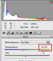
Gray Card for White Balance
The final step before going into “production shooting” was to shoot a gray card — something to use to set the WB in post-production. This is a step I almost always take. Although my lights are dead on accurate, I do this as a fail-safe procedure. I shot one reference image and used it for everything I shot during the session.
Post Production:
A. WB and Color Correction
One constraint limits the post production on art work: There is a “reality” that must be respected. The artist chose her colors carefully. She made her brush strokes and pencil lines deliberately. It’s not within the photographer’s discretion to make them different or “better”. Adjustments to either must be made with the actual work sitting next to the monitor.
And, speaking of the monitor — it has to be calibrated. That’s the only way to know that the adjustments we are making will actually make the image we are creating more accurate. Both of my monitors, the MacBook Pro on which I shot the images and the Apple and Samsung monitors on which I edited them, were calibrated with my X-Rite colormunki.
However, that, in itself really does not solve the entire color consistency problem. Because, no matter how accurate we are and no matter how rigorous our standards, if our work is viewed or exhibited on someone else’s un-calibrated monitor, the colors will not show true. Truth be told, I don’t know how any of this will look on your monitors.
I really wonder how artists can sell their work from online images. The same rings true for vendors like the rug merchant whose store is next to my studio. More than once he’s sold a rug online only to have it sent back because it didn’t look “so blue” online. Truth was, it was blue and the online image on a calibrated monitor showed it to be so. But, the customers monitor showed it to be something else.
X-Rite has taken a step toward trying to solve this problem by creating the colormunki Digital Pouch — which lets you embed your color profiles into the images you are delivering. When your clients receive them, they open them up in a special window and IF the clients’ monitors are calibrated, the colors they see are the colors you saw.
OK, back on track. The post was very simple.
I opened the images in Adobe Camera Raw. [In several upcoming posts, I’ll be writing a lot about RAW processor wars and RAW workflow. I am slowly becoming a big fan of Nikon’s NX2; in many ways, I think it starts with a more true image that requires less adjustment. But, it also has limitations and, when I know I have issues that only Photoshop can cure, I start out with ACR.]
To make sure I didn’t have color cast issues, I click balanced on the gray card, synchronized the WB setting. (The “as shot” was within 50°’s Kelvin of the corrected. the change was really not necessary, but, what can I say, I’m anal.)
Holding the framed image up near the monitor, I tweaked the clarity and vibrance settings — and I mean tweaked, just a very slight movement.
I opened the images up as Smart Objects in Photoshop (so that I could easily go back to ACR and reprocess the RAW image if I chose to.)
I had a problem that needed correcting. No matter how careful I was in trying to get the frame square with the camera lens, I was not able to make it perfect. So, I used the Filter>Distort>Lens Correction tool to straighten out the horizontal and vertical planes.

Lens Distortion Correction Tool -- Photoshop
Finally, I cloned out the Matthews arm and cropped the image to its finished size.
It took a lot longer to write about it than it took to do it all.
The key? Indirect lighting. Try it. It’s easy. And, it works.
Another Drawing From Ann

By: Ann Boucher
(Copyright: PrairieFire Productions/Stephen J. Herzberg — 2009)
Related Posts
 Camera Profiles and the ColorChecker Passport — The What, Why and How
 Busman’s Holiday: Shooting with Hanson Fong and My New Profoto D1 Airs
 Q: I’m confused. What are the differences between “hot lights” and “strobes”?
 Cool Tools: Matthews Magic Stand
 Lighting Like MacGyver
13 Responsesto “Lighting Framed Artwork: Beating the Glare”
Leave a Reply to prairiefire Cancel reply
foo


Great job very nice lighting
Carl,
Great to see you here. Hope you’ll help anchor the development of a strong community.
sjh
Great start on what I hope will prove to be a wonderful how-to site!
I myself use the Betterlight scanning back camera alongside my Cambo Legend and Cambo Master PC view cameras to reproduce artwork. Because of the linear sensor, I use constant HID lighting by Buhl (“Lightcubes”).
Along with simple white balancing, I also use a Colorchecker SG with Pictocolor’s ICorrect to profile the camera and lighting combination periodically. To add insult to injury the Betterlight has several built-in tone curves to modify the “way the camera sees.” The same profiling method can be used with SLR’s and larger format digitals as well, and really tightens up the tolerances for matching the artist’s original intended colors.
Thank goodness, though, that you didn’t attempt to polarize your lighting/lens to correct for your reflections. Your problems would have been amplified more than they were alleviated. The reflections would be gone, but you’d need to crank your iso up or increase your exposure so much that it would defeat the purpose of a high quality photograph with the noise.
If I can throw you any insight on the art copy process…feel free to pick my brain as I will probably pick yours!
Thanks, Charles.
I’d love to know more about “The same profiling method can be used with SLR’s and larger format digitals as well …”.
When you have time, can you tell us how you would do it with, say, a DSLR?
sjh
Thanks for a great article on lighting art. At first I thought you were going to talk about picture lights for art hanging on the wall. (Xenon lighting is my favorite picture light)
I am happy to know you are in Houston and might be able and willing to copy some of my oil portrait paintings since I am not a prof. photog. I have been photographing my art in full sun between 10AM & 4PM with varying results. I love the brilliant colors that sunlight brings out but I always have spots of specularity maring the copy. Can you copy 40×60 paintings? LaVon
Hi LaVon,
Thanks for the comment. For most folks, it is very difficult to control the light during the hours in which you are shooting. In one of the posted newsletters and in an upcoming post I’ll talk about using diffusion to control and even out sunlight.
However, I think it’s a lot easier to do indoors. You don’t necessarily need strobes and soft boxes. You might be able to replicate the same indirect concept with some home made boxes and a tungsten bulb. Take a look at the newsletter dedicated to Dean Collins; in it I have a cite to Tinker Tubes — his plans for home made studio equipment.
BTW– LaVon, your work is beautiful. Just visited your web site. Wow!
Charles,
Thanks for the excellent article. You just can’t beat the expertise of John Woodward. I took a class from him years ago at Florida School, “Mastering the Light”. All of his principles still hold true.
I want to try this lighting on my own artwork and then see if I can get into that niche market in my area.
Steve:
Great article. This has helped me quite a lot.
I shot some original paintings several years ago for a client, who did not want to send the pictures to NY for an appraisal. Neither did he want to remove the pictures from their resting place on the wall, for some reason.
I managed to get the shots without any glare, after much trial and error and movement of my lights.
I would have loved to have read your article before I shot those pictures. It would have made the process much easier.
Keep the articles coming. They are very beneficial to folks like me.
Dave
I really think this is a great niche market for photographers.
I think it is something that our friends and neighbors cannot do easily — and that it is an area in which we can differentiate ourselves.
Once I had my system set, I could have run through 40 framed pieces in very little time.
This is one of those tasks where lighting is the critical variable. Since most people are schooled in direct lighting, the use of indirect, which works best for this task, will make our work better and our job easier.
I use a pair of polarized speedlights (the polarizing gel is placed after the diffusers). Then, I use a polarizer on the lens. I set the camera ISO at 100, the hand-held flashmeter at 32, and shoot a Photovision calibration disk. This works quite well for framed artwork and unframed acrylic paints.
One essential element is to use a planar lens, not a zoom lens. It is of the uttmost importance to keep straight lines straight andto avoid oil-canning. I also use a carpenter’s square and a tape measures to align the centerline of the lens with the artwork.
This process also works well preparing old photographs for restoration.
This is great, I’ve been putting of making digital coies of my families very old framed photos. These were going to be a pain to do until now. I’m going to give this a run this weekend. Thanks For the tip.
Thanks for the great “how to” article. I am enjoying your site more and more. Keep up the good work.